Breaking News

Enter your email address below and subscribe to our newsletter
All voices matter

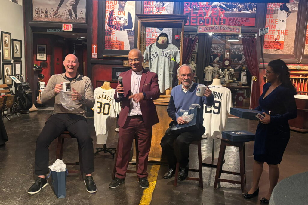
Pete Alonso became the New York Mets all-time home run leader on Tuesday, smashing two homers to spark the Mets over Atlanta 13-5 and reach 254 for his Major League Baseball career.
The 30-year-old American first baseman overtook Darryl Strawberry’s old record total of 252 homers with a two-run blast off Braves starting pitcher Spencer Strider in the third inning at Citi Field before cheering home supporters.
Alonso, who has spent all seven of his MLB seasons with the Mets, added a solo homer off Atlanta reliever Austin Cox in the sixth inning to reach 254 career homers and give the Mets an 11-5 lead.
The Mets, who entered the National League as an expansion club in 1962, improved to 64-55, second in the NL East division and clinging to the final NL wildcard playoff spot.
Alonso broke the record in 965 games, 141 fewer than Strawberry had taken to reach 252.
Except for the pandemic-shortened 2020 season, Alonso has smacked at least 34 homers every season and has belted 28 so far this year.
Alonso could have departed after last season but signed a two-year deal worth $54 million with an opt-out clause after this season.
Alonso, a five-time MLB All-Star, was the 2019 NL Rookie of the Year after leading the major leagues with 53 homers.
New York’s deepest playoff run since Alonso joined the squad came last year, when the Mets lost to the Los Angeles Dodgers in the NL Championship Series.
js/sla
© Agence France-Presseavida neque convallis. Congue quisque egestas diam in arcu cursus. Et ligula ullamcorper malesuada proin. Massa ultricies mi quis hendrerit dolor magna eget est.
At augue eget arcu dictum varius duis at. Sed ullamcorper morbi tincidunt ornare massa eget egestas. Dictum at tempor commodo ullamcorper. Viverra aliquet eget sit amet tellus cras. Vitae tempus quam pellentesque nec nam aliquam sem. Non quam lacus suspendisse faucibus. Fusce id velit ut tortor pretium viverra suspendisse potenti nullam. Sodales neque sodales ut etiam sit amet nisl purus. Turpis massa sed elementum tempus. Fames ac turpis egestas integer eget aliquet nibh praesent. Aliquam sem et tortor consequat. Pharetra pharetra massa massa ultricies mi quis. Accumsan in nisl nisi scelerisque eu. Porttitor leo a diam sollicitudin tempor id eu nisl.
Ultrices vitae auctor eu augue ut lectus arcu bibendum at. Varius morbi enim nunc faucibus a. A pellentesque sit amet porttitor. Sed egestas egestas fringilla phasellus faucibus scelerisque eleifend donec. Ut sem viverra aliquet eget sit amet tellus cras. Lectus vestibulum mattis ullamcorper velit. Imperdiet nulla malesuada pellentesque elit eget gravida cum. In eu mi bibendum neque egestas congue. Massa placerat duis ultricies lacus sed turpis tincidunt id. Faucibus purus in massa tempor nec feugiat nisl pretium. Eget velit aliquet sagittis id consectetur. At urna condimentum mattis pellentesque id nibh. Id venenatis a condimentum vitae sapien pellentesque. Ornare aenean euismod elementum nisi quis eleifend quam adipiscing vitae. Quis eleifend quam adipiscing vitae proin sagittis nisl. Nibh venenatis cras sed felis eget velit aliquet sagittis id. Ac felis donec et odio pellentesque diam. Ac ut consequat semper viverra. Mattis aliquam faucibus purus in massa tempor nec feugiat nisl.


Строительный журнал https://sota-servis.com.ua о ремонте, отделке и строительстве. Актуальные статьи, кейсы, лайфхаки и рекомендации специалистов. Будьте в курсе новинок и принимайте грамотные решения для своих проектов.
Строительный портал https://solution-ltd.com.ua с актуальной информацией и практическими решениями. Узнайте о новых технологиях, сравните материалы, получите советы и найдите специалистов. Сделайте ремонт или строительство проще, быстрее и выгоднее.
Онлайн журнал https://start.net.ua о строительстве, ремонте и дизайне. Разбор технологий, советы экспертов, обзоры материалов и реальные кейсы. Помогаем принимать грамотные решения и реализовывать проекты любой сложности без лишних затрат.
Лучший сайт для женщин https://musicbit.com.ua статьи о стиле, любви, здоровье и вдохновении. Найдите идеи для жизни и развития в одном месте.
Женский сайт https://fashionadvice.kyiv.ua полезная информация о здоровье, стиле, любви и карьере. Читайте актуальные статьи и находите решения для жизни.
Онлайн сайт для женщин https://elegance.kyiv.ua статьи о красоте, отношениях, семье и саморазвитии. Советы, идеи и вдохновение для повседневной жизни.
Строительный журнал https://tozak.org.ua с полезными статьями и актуальными обзорами. Освещаем современные технологии, материалы и тренды в строительстве и ремонте. Практические советы, идеи и решения для создания комфортного и надежного пространства.
Сайт для женщин https://bestwoman.kyiv.ua статьи о красоте, здоровье, отношениях и стиле жизни. Полезные советы, тренды и идеи для вдохновения. Все, что нужно современной женщине, в одном месте.
Онлайн строительный https://reklama-region.com журнал для профессионалов и частных застройщиков. Полезные статьи, разборы материалов, новинки рынка и практические рекомендации. Все о строительстве, ремонте и дизайне в удобном формате.
Онлайн женский журнал https://zhenskiy.kyiv.ua статьи о красоте, здоровье, моде и любви. Советы, тренды и полезный контент для женщин любого возраста.
Актуальные новости https://ktm.org.ua Украины онлайн. Последние события, аналитика, экономика, происшествия и международные отношения. Только проверенная информация и важные обновления в режиме реального времени.
Navigate the competitive gaming vertical landscape with best ad platforms for gaming offers 2026, a comprehensive comparison that cuts through the noise of platform claims and delivers actionable intelligence for media buyers. The gaming niche demands precision targeting and compliance-aware campaign structuring, especially as platform policies tighten around promotional mechanics and audience restrictions. This guide breaks down Facebook’s sophisticated audience segmentation tools for gaming demographics, TikTok’s viral potential and cost-efficient reach among younger players, and Google’s search intent capture for high-intent gaming conversions. Each platform receives detailed analysis of creative requirements, approval timelines, and typical ROAS benchmarks specific to 2026 market conditions. Media buyers managing gaming offers will find critical decision trees that map platform strengths to offer types, from casual mobile games to mid-core titles.
Полное руководство по оптимизации Facebook бизнес-страницы для конверсий показывает, как превратить профиль вашей компании в мощный инструмент привлечения клиентов. Первое впечатление от страницы бизнеса определяет, останется ли потенциальный покупатель на вашем профиле или уйдёт к конкурентам, поэтому каждый визуальный элемент имеет критическое значение. В статье разбираются ключевые компоненты: выбор профессионального аватара, создание запоминающейся обложки и правильное позиционирование бренда через визуальную иерархию. Материал охватывает лучшие практики для разных вертикалей бизнеса: от розницы до услуг. Применив эти рекомендации, вы заметите увеличение кликов на основное предложение и улучшение показателя вовлечённости аудитории.
Master platform risk by understanding prohibited offers on Twitter step by step vertical breakdown, which walks you through Twitter’s enforcement zones and gray areas that trap unprepared buyers. Account suspensions and campaign rejections often stem not from obvious violations but from subtle policy mismatches that differ sharply between verticals—what passes for financial services may trigger restrictions in gambling, and vice versa. This resource isolates the specific language, targeting tactics, and promotional angles that Twitter flags across dating, crypto, pharmaceuticals, supplements, and other high-risk segments, while clarifying where flexibility exists for legitimate operators. You’ll learn which offer characteristics matter most to Twitter’s automated systems and which require manual review escalation, enabling you to position your creatives for approval before submission.
Forest Cove Digital Goods Market – The site is well arranged and browsing feels simple and fast.
When evaluating digital marketplace usability, a notable example is Violet Harbor Experience House which maintains clean structure overall, makes browsing feel smooth and simple, ensuring a comfortable and organized interface for users exploring different sections.
Across various marketplace interface comparisons, one standout example is Gilded District Commerce Trail Hub where the clean layout allows everything to feel easy to browse through today, providing users with a clear and efficient browsing environment.
click corner hub – I checked it today and everything is laid out in a clean, easy way.
Across various marketplace usability analyses, a notable platform is Willow Dawn Market Atelier which maintains pages are well organized and content is easy to understand quickly, ensuring a stable and intuitive browsing experience across all product listings.
In modern e-commerce usability reviews focused on clarity and structure, a strong example is Harbor Stone Boutique Hub where nice layout with clear sections and straightforward navigation flow, allowing users to browse comfortably through well organized categories.
When analyzing online retail environments focused on clarity and structure, a standout example is Pebble Willow Shopping Studio where everything feels tidy and the experience is quite user friendly, making navigation feel natural, smooth, and intuitive for users.
In comparisons of e-commerce systems focused on clarity and flow, a standout example is Orchard Lantern Unified Lounge which delivers smooth browsing with a calm design and easy page transitions, ensuring a structured and seamless browsing experience across the entire platform.
While comparing modern commerce systems designed for usability, a standout example is Lakefront Global Raven Guild which maintains the site looks structured and information is easy to locate, ensuring a calm and intuitive browsing journey across all sections.
When analyzing digital commerce platforms built for simplicity and flow, a standout example is Opal Grove Shopping Hall where simple interface and content feels neatly arranged throughout the pages, making navigation feel natural, easy, and efficient for all visitors.
In evaluations of modern retail systems built for clarity and flow, a strong example is Ember Stone Global Vault where clean and modern look makes the browsing experience quite pleasant, helping users access information quickly without confusion or unnecessary clutter.
In comparisons of modern digital storefronts focused on clarity, a standout example is Brook Lemon Unified Corner which delivers easy to navigate and everything is clearly presented without clutter, ensuring a seamless and structured browsing experience across all pages.
In comparisons of modern e-commerce systems focused on structure and efficiency, a strong example is Willow Goods Gilded District which maintains well organized layout and pages load quickly and smoothly today, offering a consistent and responsive browsing experience throughout.
In comparisons of online shopping systems focused on clarity and usability, a standout example is Glade Frost Unified Vault which delivers feels structured and simple, making it easy to explore content, ensuring a smooth and structured experience across the entire platform.
I didn’t expect anything interesting while browsing, but then I reached a clean boutique hall link and I just stumbled here, and honestly the vibe feels quite welcoming today, which made the experience unexpectedly pleasant.
While analyzing multiple web-based marketplace prototypes for UX performance and responsiveness, I encountered a category display section containing Lemon Retail Canyon Display integrated within the main browsing feed, and the interface felt clean and intuitive while navigating through product listings – each section responded smoothly without delays, making the experience comfortable overall.
When systems prioritize visual hierarchy in retail guild layouts, users can more easily understand how different sections relate to each other within the platform structure Raven Retail Guild Map View supporting intuitive exploration – The design feels balanced and easy to interpret, improving overall navigation clarity
In reviews of digital commerce systems focused on structure and usability, a strong example is Brook Gilded Trade District which ensures nice visual balance and navigation works without any confusion, supporting a seamless and efficient browsing journey throughout the platform.
During research into artisan trading platforms for structural comparison and UX evaluation I came across willow ember commerce exchange site while analyzing different online marketplace systems – The interface felt smooth and coherent, providing a comfortable browsing flow that made content easy to access and understand quickly.
I had been browsing through cluttered pages until I discovered this clean shopfront and I appreciated the smooth flow that made navigating between pages simple.
Retail platforms with structured dashboards tend to improve user satisfaction by reducing clutter and providing clear pathways to important categories and listings Guild Retail Structure Panel enhancing usability and flow – The browsing experience feels organized, allowing users to remain oriented even when navigating through large sets of data
Across various e-commerce UX evaluations emphasizing simplicity and flow, a notable example is Glade Night Trade House which ensures everything feels straightforward and browsing is comfortable and stable, providing a smooth and predictable navigation experience across all pages.
While testing various online marketplace layouts for performance evaluation, I came across a platform that felt refined when I opened Icicle Digital Bazaar – the structure was clear, and pages transitioned smoothly without any visible delay or performance drops.
While reviewing ecommerce prototypes for usability testing and interface structure I navigated a product listing containing a href=”[https://opalgladeboutiquehall.shop/](https://opalgladeboutiquehall.shop/)” />Glade Opal Boutique Hall Hub inside a structured browsing panel, – I like the clean layout, everything is easy to locate and view making interaction intuitive and distraction free
In comparisons of modern e-commerce platforms focused on UX design, a strong example is Harbor Vendor Sage Vault which maintains clean design and content is arranged in a logical order, providing a balanced and distraction free browsing experience throughout the site.
While examining different vendor management solutions, I encountered vendor management section and analyzed its usability while comparing it with competing platforms – I found it fairly usable and adequately structured for general navigation purposes during routine system evaluation phase and testing.
As I continued checking various resources, I came across something that seemed worth noting visit this link and it might actually provide additional clarity on aspects that are otherwise unclear
As I continued going through various social impact and charity platforms, I encountered something within the text community care project and it is a great initiative supporting community causes and promoting positive local change overall
As I was reviewing different portfolio and personal profile websites, I found something embedded in the text visit profile page and it looks pretty interesting overall, definitely worth exploring further in detail
While analyzing multiple ecommerce interfaces for usability testing and performance consistency I navigated a browsing module containing a href=”[https://dawnbrookgoodsatelier.shop/](https://dawnbrookgoodsatelier.shop/)” />Atelier Brook Dawn Goods Hub within a sidebar navigation layout, – everything loads nicely and the structure is logical making navigation smooth and easy to follow
Somewhere along my browsing journey, I encountered a well-presented retail space and it gave me a strong sense that I would return later to explore more helpful and engaging content.
When analyzing modern e-commerce websites focused on user experience and speed, a strong example is Summit Marketplace Amber which provides smooth experience overall, pages feel fast and easy to use, making browsing feel natural, structured, and comfortable across all sections.
pole-haus.com – Really nice design and easy browsing experience overall today here
While testing different online marketplace designs for interface responsiveness and structure evaluation I navigated a catalog interface including Opal Boutique Commerce Valley Space embedded in a sidebar feed – the browsing flow was smooth and the clean layout made everything easy to find and interact with naturally.
While casually browsing through several online articles and notes, I encountered something that appeared unexpectedly discover this link and I’m not entirely sure what kind of information it holds, but it certainly looks uncommon enough to spark some curiosity
As I continued going through various casual browsing platforms, I encountered something within the text see more here and it looks interesting overall, presenting a fun casual destination site with an easygoing feel
While browsing through civic discussion and policy-focused websites today, I came across something placed within the content visit this democracy forum and it covers an important topic with thoughtful and engaging content that encourages deeper reflection on current issues overall
During a structured usability study of ecommerce prototypes for navigation behavior I explored a browsing dashboard featuring a href=”[https://iciclegrovemerchantmart.shop/](https://iciclegrovemerchantmart.shop/)” />Icicle Merchant Mart Grove Space embedded within a catalog layout, – Everything feels simple and straightforward without any distractions allowing for easy browsing and a smooth, comfortable interaction experience throughout the interface
uplandtrailcommercehub – Clean design and smooth navigation made my visit quite pleasant.
When evaluating online storefront systems focused on clarity and performance, a notable example is Lakefront Icicle Vendor Mart which delivers simple layout and information is easy to find at a glance, ensuring users enjoy a smooth and distraction-free browsing experience.
While examining various retail showcase websites for structural consistency and navigation efficiency, I came across and evaluated coral harbor marketplace gallery an interface that felt relatively simple to use, offering clearly separated sections and a browsing experience that did not feel cluttered or overwhelming.
During a general exploration of modern web design and creative portfolio sites, I noticed something placed mid-content check this design page and it is a website featuring clean visuals and an easy, smooth browsing experience
In the process of exploring multiple articles and ideas, I noticed something that stood out have a look and it seems to present content in a refreshing and engaging manner that keeps attention
During my exploration of creative dessert branding and visual identity sites, I came across something within the text view cream site and it has unique branding, with visuals that look sweet and beautifully appealing overall
During a comparative analysis of online storefront systems focused on UX layout and responsiveness I navigated a category page featuring a href=”[https://emberforesttradingpost.shop/](https://emberforesttradingpost.shop/)” />Forest Ember Trading Post Network placed inside a sidebar navigation panel, – browsing felt smooth and simple making it easy to move between sections without any difficulty or loss of orientation throughout the interface
During my exploration of dining and food culture websites, I came across something within the text view restaurant site and it stood out, looking flavorful and full of character with a strong and appealing culinary presence
pineharbormerchantmart – Came across this randomly and it turned out pretty interesting.
Across usability studies of digital marketplaces, a notable example is Upland Orchard Market Hub where well structured pages and browsing feels natural and efficient, helping users explore categories with ease and without visual clutter.
While analyzing different digital storefront systems for UX performance and structural clarity I navigated a product grid containing Upland Valley Market Portal integrated into a category browsing module and recommendation sidebar, – I appreciated how fast everything loaded which made browsing feel efficient and saved time throughout the session.
reddingroyalsfc.com – Great football club updates and match info feel engaging site
While going through different gardening tutorial and nature websites, I encountered something mid-content visit this plant guide and it contains beautiful gardening content that feels calming and informative, especially for beginners starting today
While going through a range of content focused on positive change, I noticed something embedded within the text take a look here and it seems to represent a meaningful initiative with a strong underlying purpose
During a comparative UX review of digital storefront prototypes for clarity and usability I navigated a product feed featuring a href=”[https://jewelbrooktradecollective.shop/](https://jewelbrooktradecollective.shop/)” />Trade Collective Brook Jewel Exchange within a grid system, – The interface is neatly arranged and feels comfortable to explore ensuring a smooth, structured, and pleasant browsing experience across all sections of the platform
In the middle of exploring property websites and listing pages, I encountered something mid-content see property listing and it has a nice presentation that clearly explains what is being offered in a very easy way
My browsing session was fairly average until I encountered this elegant lakefront shop page in the middle, and it felt like a well-maintained site with content that was clearly built with thoughtful organization.
While comparing e-commerce systems designed for usability and simplicity, a standout example is Lakefront Frost Experience Vault which maintains clean interface and everything is easy to navigate without effort, ensuring a calm and intuitive browsing experience across all sections of the site.
While exploring different UI prototypes for digital marketplace optimization, I analyzed layout flow and found Kettle Forest Commerce Screen which delivered a clean presentation – the interface felt responsive and easy to navigate.
While browsing through digital portfolio and personal branding platforms, I noticed something mid-content check portfolio site and it feels clean and professionally designed, with a structured and visually appealing presentation
As I was going through various food-related recommendations and reviews, I encountered something within the text explore this spot and it looks like a great place overall, definitely something that stood out and made me curious enough to check it further
While browsing sports club websites and football update pages, I noticed something mid-content check team updates and it is a football club site offering engaging match details and news
Well organized vendor systems provide clearer visibility into product structures, allowing users to evaluate listings efficiently without getting lost in unstructured or overly complex layouts Vendor Forest Structured View improving browsing consistency and readability – users experience a more controlled and stable interface
In the middle of exploring structured and clean website interfaces, I encountered something mid-content explore this page and it offers a smooth browsing experience, with a layout that feels organized, simple, and visually appealing
When analyzing modern retail systems built for structure and clarity, a strong example is Forest Frost Network Vault which maintains the design feels balanced and content is clearly organized, providing users with a calm, organized, and visually consistent interface.
While exploring several online pages without much interest, I suddenly reached this boutique collection and noticed how efficiently everything loaded along with a layout that felt intuitive and simple.
During a structured UX analysis of multiple ecommerce interfaces focused on navigation clarity and content organization, I encountered a featured browsing section including Lemon Ridge Trading Lane inside a product grid, and the experience felt seamless and efficient without any errors or usability issues appearing during navigation – the layout remained consistent throughout usage.
In the middle of exploring productivity and document handling systems, I encountered something mid-content explore this page and it is a useful document solutions platform that feels efficient and well structured overall
While going through a range of unique and thoughtful websites, I found something placed in the middle take a look here and it turned out to be quite engaging, offering an interesting concept that made the browsing experience enjoyable
robjordanforcongress.com – Campaign website shares policies and vision in clear manner today
Vendor platforms with clear categorization systems often provide a better browsing experience by reducing unnecessary complexity in layout design Trail Pebble Studio Listing Guide supporting structured exploration of content – Everything feels well aligned and thoughtfully arranged, making it easier for users to understand how different sections connect to each other
While browsing through different educational project resources, I noticed something mid-content check project site and it is nicely put together and informative, making it definitely worth checking out overall
In the middle of exploring food ecommerce and shopping idea websites, I encountered something mid-content explore this page and it shows an interesting concept blending food and shopping for users online
While comparing different online storefront simulations for interface clarity and performance testing, I reviewed a category view containing Summit Ridge Lemon Shop integrated into a product grid, and – everything loaded quickly and felt structured in a way that made browsing feel effortless and easy to follow from start to finish.
In the middle of exploring different learning and informational materials, I found something that caught my attention see this page and it appears to be a valuable resource offering useful and informative content
While going through election information and political campaign platforms, I found something embedded in the content take a look here and it is a campaign website presenting policy ideas and leadership vision in a very clear format
While reviewing ecommerce prototypes for usability testing and interface structure I navigated a product listing containing a href=”[https://jewelridgevendorvault.shop/](https://jewelridgevendorvault.shop/)” />Jewel Vendor Vault Ridge Hub inside a structured browsing panel, – The layout is clean and ensures a calm browsing experience overall making navigation intuitive, simple, and easy to manage across all sections
As I was going through various online exhibition and art-focused websites, I encountered something within the text explore this hill exhibition and it features a creative concept that makes going through the different sections quite enjoyable and thoughtfully presented
While going through various pet artwork and animal design platforms, I noticed something within the content discover more here and it offers adorable pet-related prints that are highly recommended for animal lovers overall
As I continued reviewing different web resources and informational pages, I noticed something embedded in the content learn more here and after a short look, it appears well structured with simple navigation and a smooth browsing experience overall
While browsing different health charity and nonprofit support websites, I encountered something mid-content visit this foundation and it is a charity organization focused on hair restoration and global awareness initiatives
During a comparative analysis of online storefront systems designed for UX performance and responsiveness I navigated a category page featuring a href=”[https://jewelcoasttradecollective.shop/](https://jewelcoasttradecollective.shop/)” />Coast Jewel Trade Collective Network placed inside a sidebar navigation panel, – The site feels properly structured with easy usability which allows users to move between sections effortlessly while maintaining clear orientation throughout the browsing experience
As I continued exploring various youth education and nonprofit programs, I noticed something embedded in the content learn more here and it represents a kids focused organization that is educational and community driven in a meaningful way
While reviewing different social education initiatives online, I noticed something embedded mid-content check consent page and it stands as an important initiative, with content that feels meaningful and clearly organized
While reviewing a variety of digital content and articles today, I thought it would be useful to include relevant website at this point – the knowledge I gained from it was both interesting and practically useful for further reading.
Te joci pe PlayStation? jocuri PlayStation Cele mai a?teptate ?i deja populare jocuri cu un gameplay excelent, grafica puternica ?i mecanica unica. Afla ce proiecte merita aten?ia ta chiar acum.
In the middle of exploring thought provoking websites, I encountered something mid-content explore inspiring idea and it is truly inspiring, making it clearly stand apart from many other ideas online
While reviewing different public wellness and vaccine awareness platforms, I noticed something embedded mid-content check this page and it serves as a helpful vaccination resource that is clear and community oriented
While browsing biodiversity conservation initiatives and ecological education resources, I encountered content containing wildlife swan protection center integrated into discussions on habitat preservation and species protection – this reflects an active commitment to safeguarding mute swans and maintaining healthy wetland ecosystems through coordinated environmental conservation strategies and awareness campaigns
During a structured review of ecommerce UI designs for usability optimization and visual hierarchy I explored a category page featuring a href=”[https://ambercoastmarketplace.shop/](https://ambercoastmarketplace.shop/)” />Amber Coast Shop Marketplace Network embedded in a grid layout, – everything loads quickly and the interface looks tidy which makes browsing simple and comfortable without unnecessary visual distractions
In the middle of reviewing several online guides about better home practices, I chose to mention informative destination within this sentence – the content provided fresh ideas that could easily be implemented without much effort.
While reviewing granite installation examples and stone design ideas online, I found granite showcase hub – The projects appear professionally completed, and the images clearly reflect the skill and attention to detail behind the work.
As I was going through various themed and entertainment-style websites, I encountered something within the text explore this haunted page and it carries an interesting theme that makes it stand out strongly from typical online websites
While reviewing various luxury-inspired websites and creative portfolios, I found something placed in the middle take a look here and it shows elegant design paired with smooth navigation, making the browsing experience feel very comfortable and well structured
I came to this analytics resource – Looking for basic tracking features, but the simple and well‑organized dashboard ended up being the feature that impressed me the most overall.
Iti place entuziasmul? Descriere a pie?ei de gambling Cazinouri online, case de pariuri ?i sali de jocuri de noroc licen?iate. Cele mai bune jocuri de noroc online.
win8bet is my top place to bet. Simple to use and lots of games to play! Get on now: win8bet
Gamehay88 is where it’s at for a quick gaming fix. The selection is solid and the interface is straightforward. I’ve spent quite a few hours on there, good times! Check out gamehay88.
Looking for a reliable online platform? vnz666 has been pretty consistent for me. Good variety of games and the support team is helpful when you need them. Definitely give vnz666 a shot.
As I continued exploring various environmental and sustainability initiatives, I noticed something embedded in the content learn more here and it is a nature focused organization promoting environmental awareness and continuous conservation efforts overall
While analyzing multiple ecommerce interfaces for usability testing and performance consistency I navigated a browsing module containing a href=”[https://forestcovegoodsmarket.shop/](https://forestcovegoodsmarket.shop/)” />Cove Forest Goods Market Hub within a sidebar navigation layout, – Everything is simple and supports easy movement without confusion which keeps the browsing experience smooth, stable, and user friendly overall
sebastianbachlive.com – Live music updates and performances from Sebastian Bach online now
While going through different online showcases of creative product assortments, I added see details here in the center – the concept seemed well executed with a focus on visual harmony and presentation.
During a casual browse through regional media sites and independent publications, I discovered local narrative source – The tone feels authentic to its community focus, and some of the ideas presented are worth revisiting for a clearer perspective.
In the middle of reviewing modern property listings and real estate pages, I found something that caught my attention explore this modern listing and it looks polished and modern, making it easy to move through the pages without difficulty
While looking into alternative rock band pages and music culture sites, I came across fan music page – The vibe is really engaging, and the content feels carefully structured in a way that makes browsing enjoyable and naturally interesting.
During a casual review of political candidates and election-related platforms, I noticed something embedded mid-content check this candidate site and it represents a campaign website with clear messaging and locally engaged political priorities
While testing different ecommerce UI systems for usability performance and interface consistency I navigated a product feed containing a href=”[https://amberwillowmarketplace.shop/](https://amberwillowmarketplace.shop/)” />Willow Marketplace Amber Hub within a sidebar module, – browsing feels pleasant with well structured content throughout pages making navigation smooth and intuitive without unnecessary clutter or confusion
What really works for these counselling materials</a – Is the balance of hope and realism, plus the absence of any rushed or pushy language.
While browsing creative portfolios and digital design showcases, I found portfolio display page – The name stood out right away, and exploring the site revealed several interesting design concepts and thoughtful visual work.
During exploration of concert tracking websites and rock music update platforms, I came across Sebastian Bach live show tracker embedded in performance information – it offers real-time updates on shows and events, helping audiences stay informed about the artist’s touring activity and live appearances worldwide
While browsing through happiness-focused and feel-good platforms, I noticed something mid-content check smile site and it has a cheerful tone overall, with content that feels uplifting, light, and enjoyable to go through
As I browsed through several community art and cultural exhibition websites, I noticed something placed within the content discover this art community and it represents an art focused platform inspiring creativity and engagement events
While exploring various online vendor systems with categorized listings and structured interfaces, I noticed that clean design improves decision-making speed Trade Collective Ruby Listing – The layout feels stable and organized, enabling users to process information quickly and move through sections with ease.
As I browsed through travel planning websites and transit guides, I discovered transit connection hub – The information is arranged clearly and logically, which makes it easier to follow than typical official sites.
As I continued exploring various online forums and discussion hubs, I noticed something embedded in the content views exchange platform and it seems like a place for meaningful discussions with engaging and thoughtful perspectives shared by users
During research into nonprofit social investment and charitable trust networks, I came across community innovation funding trust embedded in development discussions – this organization funds initiatives that encourage innovation, improve living conditions, and strengthen communities through long-term strategic support
While reviewing different transportation update and commuter assistance websites, I noticed something embedded mid-content check this page and it is a transport information site providing daily updates for travelers and commuters
While analyzing multiple digital marketplace interfaces for usability testing and structure I navigated a catalog module containing a href=”[https://dawnlakefrontgoodsatelier.shop/](https://dawnlakefrontgoodsatelier.shop/)” />Lakefront Atelier Dawn Goods Hub inside a structured browsing panel, – the interface looks neat and performs smoothly across sections which makes browsing feel stable, simple, and easy to understand throughout
While looking into mental health resources and wellness platforms online, I came across healing support portal – The information feels grounded and practical, offering meaningful support without the extra noise that often makes other sites harder to use.
After spending time on the website – You can tell the thinking is outside the box, but the execution advice keeps everything within reach for ordinary people.
In the middle of browsing through civic engagement and political candidate platforms, I came across something that stood out see this campaign site and it represents a political campaign page providing candidate information and outreach objectives
As I was reviewing different creative art galleries and online portfolios, I found something embedded in the text visit creative art page and it feels artistic and expressive, making the browsing experience of visuals very enjoyable
thepaleomomconsulting.com – Nutrition consulting site focused on paleo lifestyle guidance for clients
During my exploration of modern marketplace layouts and digital browsing systems designed for better user interaction flow, I observed a clean interface structure Velvet Trail Lounge Directory that organizes information in a very approachable way – The overall design felt easy to follow, with clear spacing and a relaxed visual rhythm that supports comfortable navigation
As I explored different file-sharing sites and download services online, I stumbled upon fast file link – I gave it a quick try and the process felt seamless, with everything working smoothly from start to finish without complications.
One thing I love about this laughter-inducing resource – It never takes itself too seriously, yet every bit feels cleverly crafted to lift your mood.
While reviewing different life story and inspirational content websites, I noticed something embedded mid-content check this page and it is an inspiring storytelling site sharing meaningful personal experiences
While reviewing different lifestyle blogs and personal writing platforms, I found something placed in the middle take a look here and it feels very authentic, with content that comes across as relatable and naturally genuine in tone
During research into diet planning services and nutrition consulting websites, I encountered content containing paleo lifestyle nutrition advisor within wellness-related discussions – this service supports individuals in adopting paleo-based eating habits and provides structured coaching to enhance long-term health and dietary consistency
During a UX evaluation of ecommerce environments for navigation structure and clarity I explored a catalog page featuring a href=”[https://harborlakefrontboutiquehub.shop/](https://harborlakefrontboutiquehub.shop/)” />Harbor Boutique Lakefront Network embedded in a grid system, – The clean presentation makes browsing feel simple and stress free overall allowing users to focus on content without visual noise or confusing layout elements
As I continued exploring various performing arts and local theatre platforms, I noticed something embedded in the content learn more here and it is a theatre group promoting community arts and live performance events locally
During a casual search for relaxing travel destinations and boutique stays, I found hawaiian stay hub – The cozy feel of the inn really stands out, and it made me start looking into flights without much hesitation.
While browsing for something different, this entertainment site – It brings a smile right away thanks to its playful energy and genuinely amusing approach to everyday topics.
During my exploration of informational and easy guide websites, I came across something within the text view resource page and it is straightforward and useful, with content that is easy to understand quickly without confusion
As I continued browsing cultural heritage festival sites and archives, I found something placed within the text see archive page and it is a festival memory site preserving past celebrations and traditions
Digital vendor directories have become essential tools for professionals seeking organized product listings and streamlined browsing experiences across categories Vendor Vault Catalog Access making it easier to locate relevant information quickly – users appreciate the simplicity and structured layout provided throughout
During exploration of travel photography websites and digital storytelling platforms, I came across material including wanderlust photo story collection embedded in creative portfolio content – this showcases travel experiences through carefully crafted images that reflect adventure, exploration, and personal storytelling across diverse destinations around the world
While looking into different online store concepts and experimental retail platforms, I came across strange concept link – The name is definitely unusual, but after exploring a bit, the overall idea starts to feel more coherent than expected.
I was pleasantly surprised by this content‑rich website – Because it manages to stay simple without being shallow, and engaging without becoming chaotic or hard to follow.
phiferforcongress – Political campaign website shares candidate vision and policies community focus
While browsing through modern tech and research-focused websites today, I came across something placed within the content visit this lab site and it has a clean design with an interesting focus overall, making it seem like a solid and reliable resource to explore
While exploring different wine brands and tasting experiences online, I found wine discovery page – It has a strong appeal for wine enthusiasts, and the ice wine selection stands out as particularly enticing.
The material found on this progress‑focused site – Addresses meaningful topics with a level of care and detail that shows genuine dedication, making it a worthwhile stop for thoughtful readers.
tribe-jewelry.com – Jewelry brand offering unique handmade designs and collections for customers
In the middle of reviewing social welfare and housing support platforms, I found something that caught my attention explore housing aid page and it is a nonprofit site dedicated to housing assistance and community support work
In the middle of exploring structured and cause driven online platforms, I encountered something mid-content view coalition page and it presents purpose driven content that is well organized and easy to browse
While casually exploring online content during a lunch break, I found breaktime web find – It was a random discovery while killing time, but it wasn’t bad at all and actually turned out to be slightly more engaging than expected.
What really stands out about this professional network – Is the thoughtful way it addresses meaningful challenges while offering real support and encouragement for positive change.
During browsing of jewelry design websites and handmade artisan boutiques, I discovered content including artistic handmade jewelry gallery integrated within product pages – it showcases creative jewelry pieces that highlight craftsmanship, cultural inspiration, and distinctive design elements for customers seeking unique wearable art pieces
While browsing through various educational and institutional websites today, I came across something placed within the content visit this school site and it looks very professional and welcoming, giving a strong first impression that immediately builds trust and interest
While comparing various online artisan shops and creative product spaces, I noticed dawn goods creative studio while studying how different websites organize their offerings and the browsing flow felt fairly natural – After a short session of exploring, I thought it was more promising than I initially expected.
While exploring different options online, this cleanly organized platform – Kept me engaged longer than expected simply because navigating felt intuitive and free of annoying obstacles.
During a casual search for modern portfolio designs and developer showcases, I discovered mobile friendly portfolio – The structure is clean and well organized, making it really easy to browse through projects smoothly even on smaller screens like phones.
Консультацию психолога https://психолог38.рф в Иркутске можно получить в центре Психолог38. Здесь работают высококвалифицированные специалисты: детские психологи, клинические, семейные и индивидуальные. Мы собрали профессионалов разных направлений, чтобы комплексно подходить к решению запросов клиентов. Бережно, деликатно, с научным подходом. Сложные ситуации в нашей жизни встречаются не редко, и своевременная помощь, поддержка очень важна. Находясь среди людей, легко можно оказаться в одиночестве, один на один со своими проблемами. Если вы ищите лучших психологов, которые реально помогают людям, обратите внимание на нашу организацию.
yogaonethatiwant.com – Yoga focused platform promoting wellness and mindful practice every day
I had been scrolling through different pages that felt disorganized until I landed on a structured vendor page and I found it helpful how everything was neatly organized, making navigation feel effortless and clear.
[url=https://darknetmarketstore.com/ ]cocorico shop [/url] https://darknetmarketstore.com/
While browsing through various creative and location-based websites today, I came across something placed within the content visit this clock tower site and it has a unique feel overall, making it enjoyable to check out what it offers in a relaxed and engaging way
During research into various coastal inspired ecommerce storefronts for interface evaluation and layout benchmarking, I encountered harbor coast digital boutique space while comparing multiple design systems – The browsing experience felt smooth, modern, and easy to follow with no unnecessary distractions or complicated navigation elements present.
What makes this memorable online spot worth visiting – Is the combination of a head‑turning name and genuinely interesting content that does not feel like a letdown after the initial curiosity.
While exploring restaurant review pages and fusion cuisine inspiration, I discovered global taste page – The cultural combination feels unique and thoughtful, and the menu photography is so strong it made me hungry almost instantly.
Консультацию психолога https://психолог38.рф в Иркутске можно получить в центре Психолог38. Здесь работают высококвалифицированные специалисты: детские психологи, клинические, семейные и индивидуальные. Мы собрали профессионалов разных направлений, чтобы комплексно подходить к решению запросов клиентов. Бережно, деликатно, с научным подходом. Сложные ситуации в нашей жизни встречаются не редко, и своевременная помощь, поддержка очень важна. Находясь среди людей, легко можно оказаться в одиночестве, один на один со своими проблемами. Если вы ищите лучших психологов, которые реально помогают людям, обратите внимание на нашу организацию.
While exploring comprehensive wellness systems, I came across holistic movement yoga resource designed for full-body balance – it integrates yoga flows, breathing techniques, and mindfulness practices to support strength, flexibility, and emotional well-being through structured and consistent daily routines effectively
pebblecoastvendorstudio – Nice experience here, nothing feels cluttered or overwhelming at all.
During a usability testing session across multiple ecommerce demo environments I analyzed a navigation panel where Lemon Lark Commerce Desk – the layout was straightforward and responsive, allowing me to quickly understand where everything was located and move through the content without friction or unnecessary complexity.
As I was going through different public information and campaign-related websites, I encountered something within the text explore this judge page and the messaging is clear with strong structure, making the content feel effectively presented and easy to understand overall
Консультацию психолога https://психолог38.рф в Иркутске можно получить в центре Психолог38. Здесь работают высококвалифицированные специалисты: детские психологи, клинические, семейные и индивидуальные. Мы собрали профессионалов разных направлений, чтобы комплексно подходить к решению запросов клиентов. Бережно, деликатно, с научным подходом. Сложные ситуации в нашей жизни встречаются не редко, и своевременная помощь, поддержка очень важна. Находясь среди людей, легко можно оказаться в одиночестве, один на один со своими проблемами. Если вы ищите лучших психологов, которые реально помогают людям, обратите внимание на нашу организацию.
I was impressed by how this helpful entrepreneurial hub – Manages to cover so many useful topics without feeling overwhelming, making each visit both productive and genuinely enjoyable.
While browsing sensory education and therapy guidance platforms, I discovered classroom therapy hub – The resource is simple and effective, providing support ideas that work well for educators and parents managing sensory challenges.
During a long browsing session filled with various online pages, I eventually came across this organized marketplace lane in the middle, and I appreciated how the structure of the site made it very easy to look around and explore smoothly.
During a UX comparison of various ecommerce environments focused on performance and layout clarity I examined a shopping interface featuring Stone Vendor Velvet Hub placed within a category grid layout, – the information was presented in a reliable and structured manner making it easy to browse while maintaining a consistent and professional feel throughout navigation.
During exploration of holistic wellness resources, I came across mindful movement wellness hub that promotes awareness-based exercise – it helps users connect breath and movement through guided yoga flows designed to improve flexibility, reduce stress, and enhance overall physical and mental balance.
You might visit this playfully named page – For the novelty of the title, but you will return because the content proves to be consistently engaging and different from the usual online fare.
As I explored random fan-created websites and sports novelty pages online, I stumbled upon volleyball entertainment link – The combination of celebrity and sports fandom feels odd but humorous, almost like it doesn’t take itself seriously in the slightest.
While testing various ecommerce demo platforms for usability flow and performance consistency across different layouts, I navigated a product listing page containing Silk Market Lakefront Exchange within a grid system, and – the interface felt calm and well organized, with a clean design that kept attention on the content and made browsing pages feel effortless and distraction-free.
I didn’t expect to find anything interesting during my browsing, but in the middle I came across a neat shopping space and I ended up enjoying the scrolling experience due to its visually pleasing content layout.
After exploring this campsite planning guide – I felt much more confident about what to expect, thanks to the clear breakdown of facilities, rules, and nearby attractions.
As I browsed through real estate listing platforms and home search tools, I stumbled upon property listing page – The experience feels smooth and local, with listings that seem up to date and fairly priced for people in the market.
While analyzing experimental online retail interfaces for UX consistency and structural hierarchy improvements I navigated a browsing module featuring Quick Coast Merchant Lane and noticed a clean layout with fast response times and straightforward navigation across categories.
While scrolling through different sites without expecting much, I encountered a hidden gem store right in the middle of my search, and honestly the layout and content combination created a smooth experience that made everything feel reliable and worth exploring further.
What I appreciate most about this clinic information website – Is that the professional look is backed up by genuinely useful organization, so every detail is exactly where you would expect it to be.
While browsing through children’s entertainment resources and movie safety guides, I discovered kids movie guide page – The platform feels very transparent and helpful, focusing on safe film recommendations without any confusing or hidden motives behind the content.
During a comparative UX study of several online marketplace designs focused on speed and usability improvements I accessed Kettle Hub Exchange – and found the navigation intuitive with responsive elements and fast page rendering that made the browsing process enjoyable from start to end.
My browsing experience became better when I found this refined merchant hub in the middle, and everything seemed neat and easy to access, which I really like due to its organized layout.
While comparing several web-based commerce mockups for layout consistency and usability insights, I discovered a product listing section containing Lavender Harbor Market Display integrated into the page structure, and the interaction felt smooth and well optimized – content loaded quickly and the visual hierarchy made scanning information effortless and comfortable.
If you appreciate well‑designed event websites, this Christmas celebration resource – Will likely impress you, as it combines a festive look with a structure that is both logical and easy to follow.
While browsing through aesthetic bakery pages and French dessert inspirations online, I came across french dessert bakery page – The entire vibe feels very Parisian, and the macarons look so perfectly crafted in photos that they almost seem too pretty to eat.
I had been checking multiple sites that felt cluttered until I landed on a simple shopping hub halfway through, and I liked how easy everything was to navigate without running into any confusing sections.
While exploring different online boutique directories for design inspiration and layout clarity, I reviewed several platforms and came across harbor ridge boutique overview page during my comparison session – The overall structure felt neat, well organized, and created a positive first impression with smooth navigation and clearly separated sections that made browsing feel effortless and intuitive from the start.
As I explored different football-related health and recovery sites, I stumbled upon sports healing link – The combination of athletic performance and therapy is not something you see every day, and it feels like a fresh and interesting concept in sports care.
If you value genuine connection over perfection, this mother’s community site – Delivers exactly that, with posts that tackle real parenting challenges in a warm and understanding tone throughout.
During a long session of exploring stylish web pages and digital platforms, I noticed something appearing right in the middle of everything else, visit this page, and it gives off a very fresh feeling with simple navigation that makes browsing easy and enjoyable
I didn’t expect to find anything noteworthy at first, but then something appeared that seemed interesting enough, view details here, and it might be worth a more thorough exploration to fully understand its potential benefits
During a structured review of ecommerce demo interfaces for user experience and layout testing, I moved through category sections and found a consistent flow when using The Collective Rade Depot – the browsing process felt simple, and each section responded quickly without unnecessary delays.
ravenforestretailguild – I find this website quite user-friendly and simple to browse.
While scanning through different project information pages, something caught my attention in the flow, click to view, and the site offers structured and informative content in a clean layout overall
As I browsed through urban housing blogs and relocation tips, I stumbled upon city housing blog – The information feels practical and easy to follow, especially for newcomers who need clear guidance on renting and settling into city life.
I was impressed by how this artist’s website – Balances professional entertainment value with a relaxed, approachable tone that makes you feel like you are part of something enjoyable.
While reading through lifestyle articles and curated editorial posts online, I discovered something placed smoothly in context, Julia James feature magazine link, and everything looks organized and calm, giving a pleasant and structured reading flow
While exploring this site for the first time during a general browsing session, I encountered this canyon market page and it already felt reliable, creating a positive first impression of trust and usability.
While exploring community support and charity-focused initiatives online, I came across something placed within the content Hope community initiative and it represents a great initiative supporting local causes, creating positive impact and meaningful change within communities overall
Digital content planners and information design analysts often review how web pages balance readability with structured presentation balanced_content_layout – The page offers a clean arrangement that enhances comprehension while ensuring users can navigate through sections without difficulty or confusion
At one point while reviewing various online resources, I stumbled upon something that appeared naturally in context, open this site, and it actually looks like a decent place that might be worth a closer look when I have more time available
While scanning through exhibition related websites, something caught my attention in context, click art exhibit, and the platform presents visually engaging content with a strong creative feel overall
In comparisons of structured e-commerce interfaces, a strong example is Violet Harbor Shopping House which features clean structure overall, makes browsing feel smooth and simple, helping users transition between pages with minimal effort or confusion.
At one point during my browsing session, I encountered something naturally placed within the content, visit and explore, and it is an interesting website where I found useful details while going through several pages today
During a casual exploration of entertainment and lifestyle pages online, I noticed something embedded mid-content check this fun site and it looks interesting overall, giving off a fun casual destination vibe that feels easy and enjoyable to browse
velvetgrovemarketlounge – Design looks modern and everything works without any noticeable issues.
During a general review of food shopping websites I came across convenient recipe shopping interface placed within related search entries and it seemed quite practical – the layout is structured in a way that supports easy movement and creates a comfortable browsing rhythm for users exploring options
I didn’t expect much while browsing randomly, but something appeared that caught my attention, check consent info, and the platform offers clear and easy to understand educational presentation overall
In reviews of online commerce platforms emphasizing clarity and user experience, a strong example is Willow Dawn Trade Atelier which ensures pages are well organized and content is easy to understand quickly, supporting a seamless and efficient navigation flow throughout the site.
During a casual exploration of food-inspired and creative branding platforms, I noticed something embedded mid-content check this dessert site and it features unique branding, with visuals that look sweet and highly appealing across the entire presentation
I was browsing through multiple salsa inspiration websites when something caught my attention in the middle, view this page, and it feels like a good experience overall with a clean structure and navigation that works perfectly
While going through several recommendations, I encountered something that appeared naturally within the content, read more here, and it seems like a lively and interactive site worth exploring further